UX / UI
App for encouraging daily activity
Role
In this project I worked with:
UI
User-testing
Group
5 students
Tools
Figma
background
Physical movement and exercise increases both mental and physical well being. However, physical movement among children and teenagers is decreasing, and motionless time spent in front of screens is increasing.
In Sweden only around 50 % of kids get to school using an active mode of transportation and only two out of ten reach the recommended levels of physical activity.
Furthermore, both gender and socio-economic background have a significant influence on the degree of physical movement. An app was created to tackle this issue. This was done in a group of 5 Interaction design students.
Concept
StepUp is a physical health initiative teaming up with schools to reach one common goal – raise awareness around daily movement and get teens to increase it. This is done through tracking steps, flights of stairs as well as active time. Through tailored push-notifications StepUp boosts the individual and encourages more daily movement. The focus is on the individual's movement but the app tries to take a step back from the performance focus that most step counter apps has today and rather focuses on the movement that actually got done, rather than that goal that didn’t get fulfilled.
In StepUp school classes can compete against each other in exciting challenges. The users track the progression of their class through animations of the teams performing the challenge. External stakeholders or the schools themselves can add prizes to the challenges, such as money towards a school trip to further motivate and create incentives for walking. For a lot of kids movement, and especially physical competition is discouraging due to feelings of uncertainty and ineptitude. Thus to make the competitive element encouraging for all kids the challenges are designed to never display the individual’s performance, only the performance of the whole team. Thus everyone can participate on their own terms, and each kid knows that their contribution matters.
Research
The development process was based on a qualitative study from Karolinska Institutet , where 133 kids in the 9th grade from varying socioeconomic status were involved in interviews and focus groups regarding everyday physical activities. The study was analysed and personas created based on the interviews that were conducted in the study. Problems and opportunities were listed and functionalities were brainstormed from these.
Design
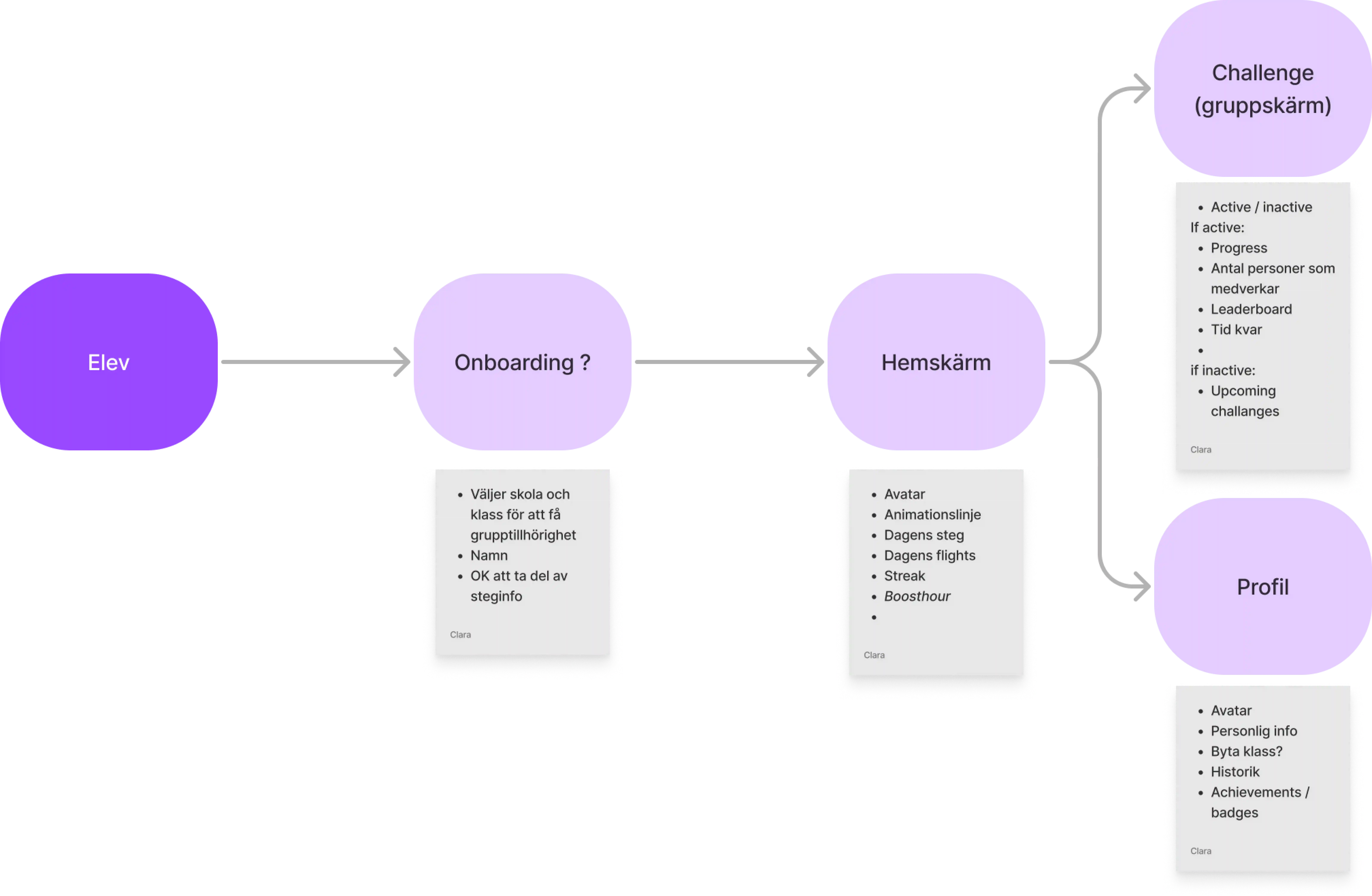
Quick paper sketch wireframes were made to map out different solutions for the functionalities written down in the brainstorming session. A user flow was then created to prepare for further prototyping.
The paper sketches were then refined into a low-fidelity prototype made in Figma.

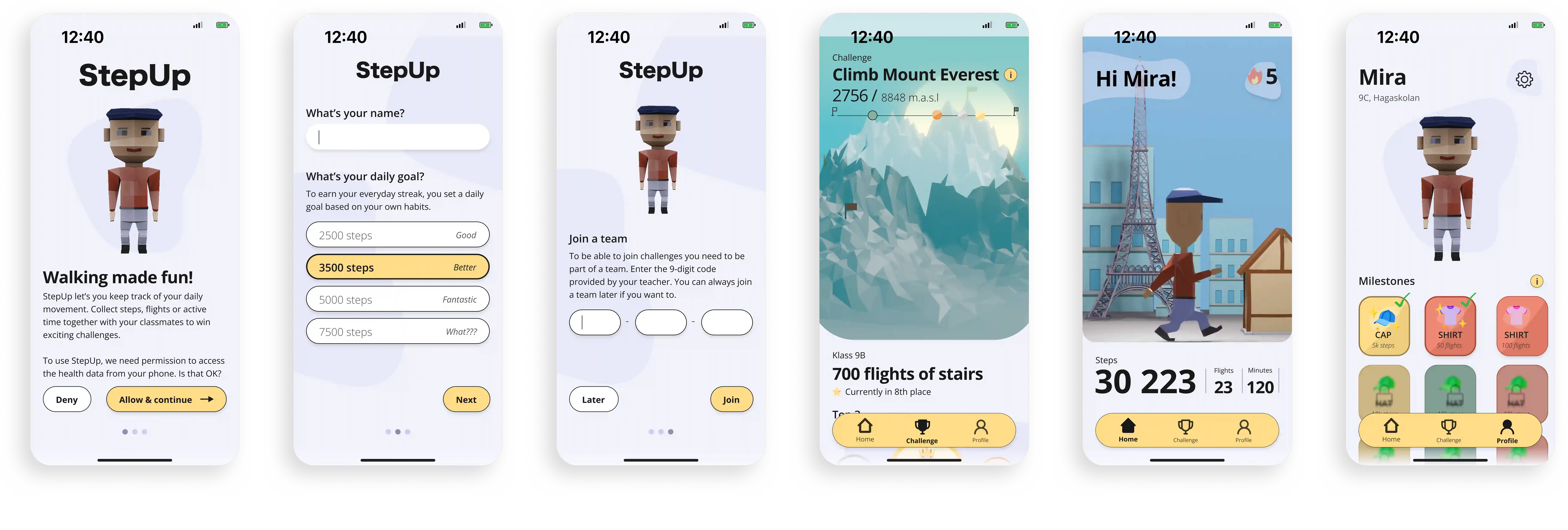
This was later refined into a high-fidelity prototype. Below the onboarding is presented as well as the Home, Challenge and Profile screen.
Evaluation
Notification
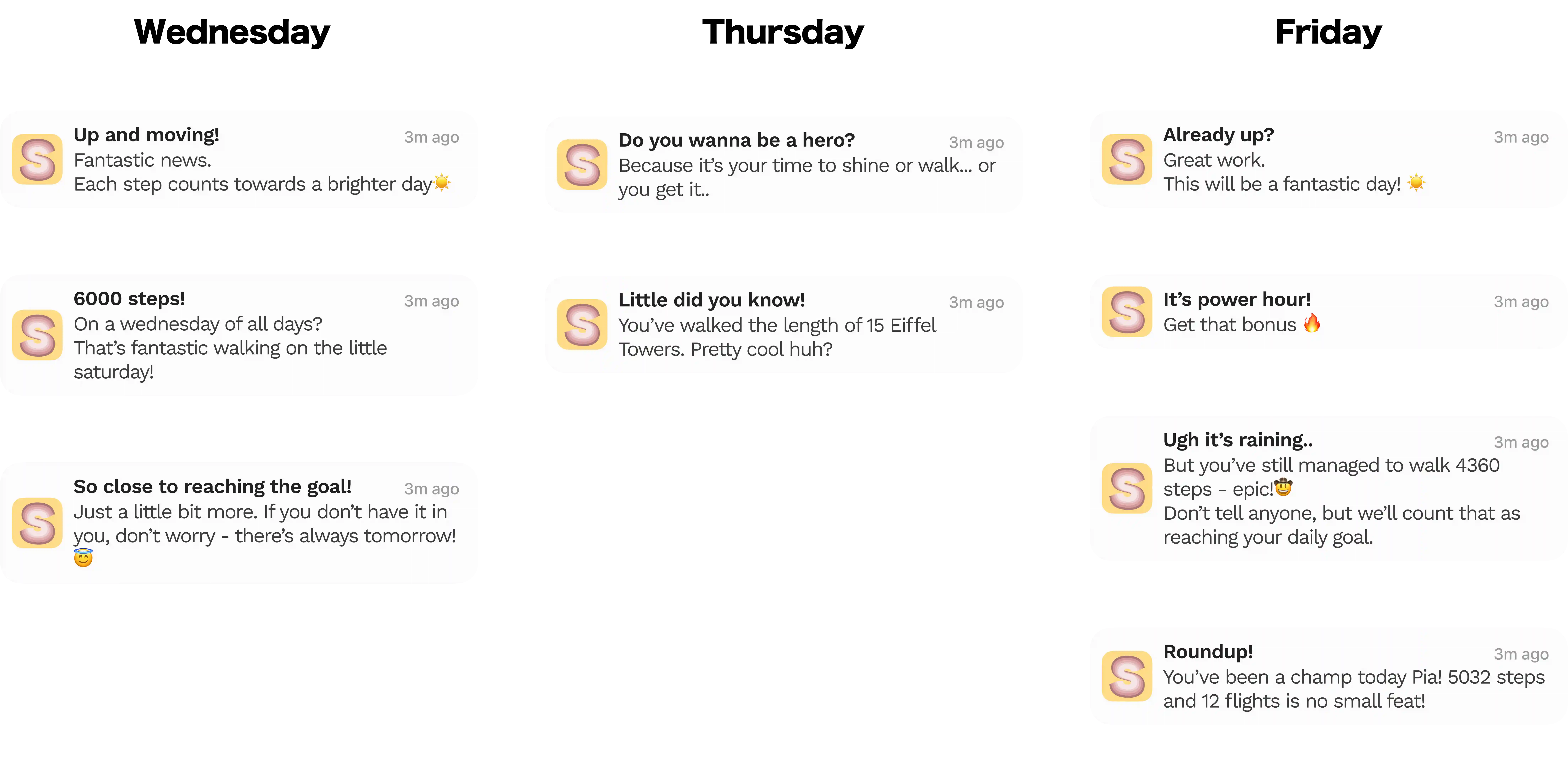
In order to test the notification design and delivery, notifications in the form of text messages were sent out to the participants according to a pre-made schedule. The test took place over three consecutive days, with different quantities and styles of notifications each day to investigate the optimal way of sending notifications. This test was performed on five participants, who were as close to the target group age as possible.
The main factor highlighted during the notification evaluation was the importance of timing. A large majority of the participants found the notifications to be motivating and fun rather than annoying; however they emphasized that timing played a big role in how they were perceived. For example, one participant pointed out that on the first day the first notification came after they had already arrived at school, which meant that it did not affect their trip. However on day three the notifications managed to time when the participant was on the move, making the notifications more relevant and thus the whole experience felt more tailored.
UI
The evaluation of the user interface and usability was done through the online platform Maze. The participants were asked to perform certain tasks such as “Complete the onboarding process”. These were then followed by questionnaires related to the expression and usability of the interface. The test was performed on 15 randomly selected participants. The participants found the onboarding clear, quick and informative when given the task of describing it with a few words. The average duration was 46,9 seconds which is considered reasonable for three frames needing some kind of interaction from the participant.
When asked to find certain information on the home and challenge page in the app, a pattern was discovered. When the bottom of the screen was more information-heavy than the top, participants expected the information that they were looking for to be at the bottom, which caused some information at the top of the screen to be overlooked and took longer to locate. However, when the information was more evenly distributed on the screen, the participants had no major problems finding the right information, no matter the placement.
